Project graph
The graph shows you the progress you’re making toward completing your project and estimates when you’ll complete it.
Overview
Project graphs autogenerate once the status of a project has been moved to a Started status and we’ve collected enough project issue data for them to be created. Project graph statistics update hourly with the latest issue activity, and the time granularity of graph points is every 7 days. Predictions are calculated based on weekly velocity data.
Where to find it
From the project view, open the project sidebar Cmd/Ctrl I to view the graph. If it’s not there, that means that we have not generated it yet.
ProTip: It can be helpful to set a target date to deter scope creep and create accountability for the project to ship in a reasonable amount of time.
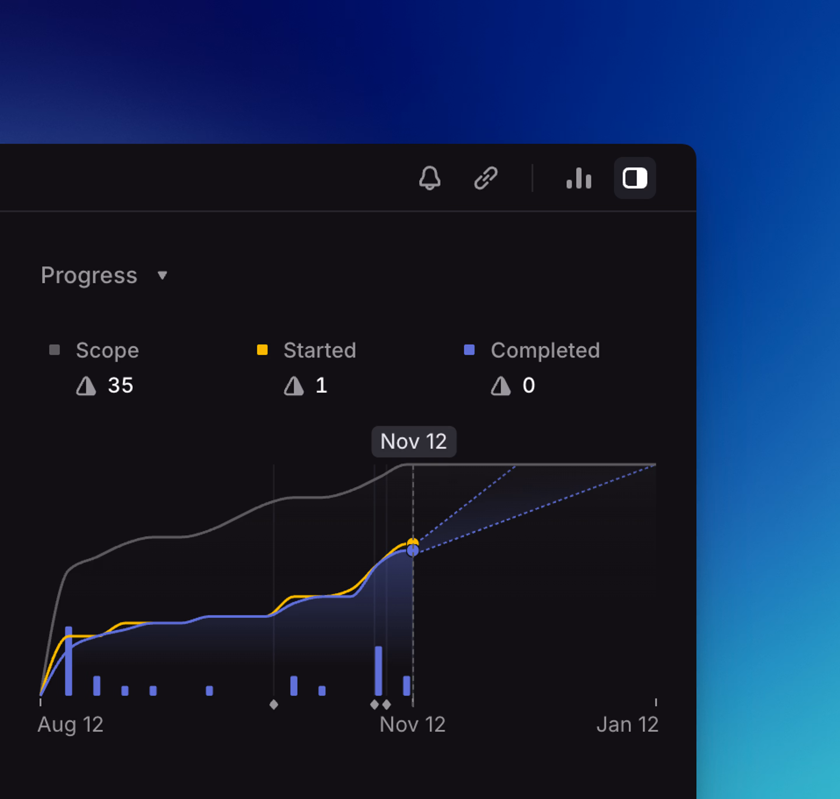
How to read it
A gray line shows you the project scope and how it has changed over time, giving you an easy way to see (and mitigate) scope creep.
We have separate lines for Started and Completed issues. This lets you see exactly what is being worked on and what is done. Blue bars also indicate completed issues over time for ease of interpretation when Started and Completed lines overlap.
You can see how a project’s issues break down by assignee and label, as well as what percentage of issues in those categories have been completed. You can hover over any assignee or label and click “filter” to show related issues.
You can also hover over the graph to see the exact values of scoped, completed and started issues over time.
If you have a target date set, it’ll show up as a red vertical line.
Live predictions
We show an estimated completion date for the project as long as you’ve moved an issue into a “Started” status. You’ll see the purple line for completed issues continues on with a dotted line to the predicted completion date. The graph will always start at 0.
The projected completion date(s) are calculated by how long it will take to complete the remaining issues based on the current weekly project velocity.
Project velocity is calculated based on weekly historical data: how many completed issue points per week. More recent weeks are weighted more heavily, as they indicate a more current rate of progress. We need at least one week of data to show prediction.
Remaining issue points are calculated by summing the points of incomplete issues with a 1/4 modifier for any in-progress issues. After calculating a predicted completion date, we offer an optimistic and pessimistic completion date that includes a buffer of about ±40%. When available, these predictions are displayed as dotted lines starting from the Completed line at the current date.
FAQ
This can happen when project scope is reduced, in order to maintain a representative relationship between the Scope and Progress lines. Examples include when someone deletes or removes issues from a project, cancels issues from a project, or reduces issue scope.