Cycle graph
The graph displays the progress you’ve made in your cycle.
Overview
Cycle graphs autogenerate once a cycle has begun and update automatically as work in the cycle changes. When viewing a specific cycle, open the cycle sidebar with Cmd/Ctrl I to view the graph.
From the Cycles view, you’ll also see the graph belonging to the current cycle.
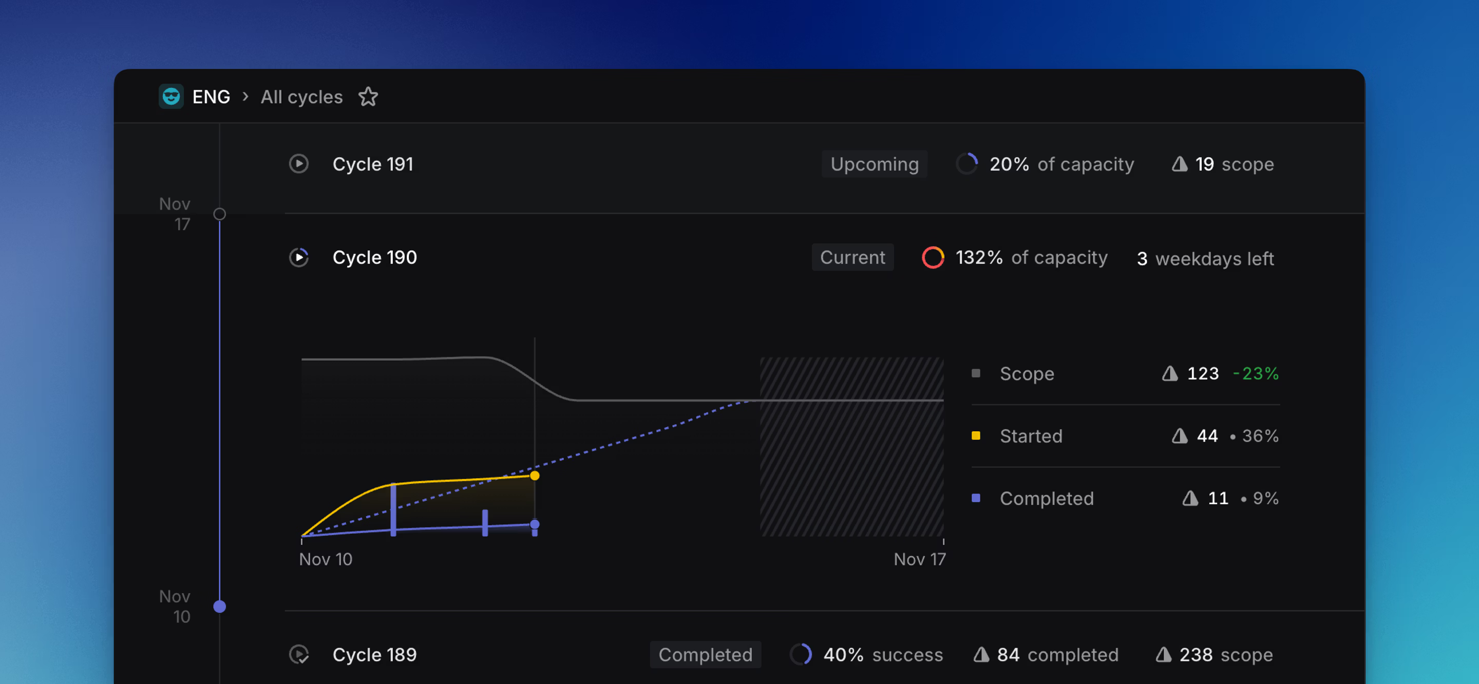
How to read a cycle graph
The gray line displays the total scope of your cycle.
The blue dotted line represents the “target”—an even distribution of the total estimated points within the cycle over the remaining days in the cycle. It flattens over weekends since people generally do not work on weekends. If your progress line stays at or above the target line, you are on track to complete everything within the cycle.
The yellow line depicts the number of issues started. It is drawn stacked on top of the completed line, so the combined height of the yellow and blue areas represents all active work.
The solid blue line shows how many issues have been completed.
The blue bars also represent completed issues. This can be useful to more easily compare relative issue completions over time, especially in cases when completed and started lines travel nearly identical paths.
Understanding scope
Scope is based on the total work in the cycle. Depending on the options selected in Settings > Team > General > Estimates, this uses estimate points, including the team default for issues without an explicit estimate, or falls back to issue count.
Assign completed issues to previous cycles
Issues that were already part of a cycle when it closed can still be counted back into that cycle if they are completed shortly afterward, before the next cycle starts.
FAQ
The overall Cycle Success is calculated based on the percentage of issues completed or started during a cycle. Completed issues are fully counted, while started issues are counted as 25% done.
For an example cycle with 10 issues, where 5 are completed, 4 are started and 1 is untouched, you will see 60% cycle success (4 started issues × 25% = 1 issue equivalent, or 10% of 10 total)