Insights
Real-time analytics for all your Linear data. Visualize issue data to spot trends and remove blockers.
Available to workspaces on the Business and Enterprise plans.
Overview
Insights turns your Linear issues into a dataset you can analyze to better understand how you work. Use Insights to answer questions like:
- What projects take up the most resources?
- How quickly do you fix bugs?
- How consistently do you prioritize issues?
- Do you estimate accurately?
Configure
Most issue views in Linear have an Insights panel in the righthand sidebar, which you can open with Cmd/Ctrl Shift I. Find Insights in Custom Views as well as team, project, and cycle views.
The best place to use Insights is in custom Views that are shared at the Workspace level. They offer the most flexibility and power, since you can access issue data from all teams and filter across any property (e.g. Label, Assignee, Project) in your workspace.
Examples
The best way to learn how Insights works is to try it. We’ve built an in-app Help Center that walks you through common use cases. You can view instructions on how to create these examples or select a button to apply the example to your current view.
Access the Help Center by selecting the … icon from the Insights panel and selecting Insights examples
Create Insights
Apply filters
Insights will offer analytics for all the issues in the view you’re currently looking at. Add or remove filters to change which issues are included in the dataset. The following filters can be especially helpful when creating Insights.
| Filter | Why it's helpful for Insights |
|---|---|
| Created at | Limits issues to those created during a certain timeframe |
| Completed at | Limits issues to those completed within a certain timeframe |
| Status Type | Works across teams (even if Statuses are named differently) |
| Label, Project, Team | Refines large views to most relevant issues |
To include Archived issues in your Insights analysis, open the Insights options (to the left of the three dot menu, just above the Segment dropdown) and toggle on Show archived issues. From there you can also filter out issues without a priority assignment.
Select Insights Parameters
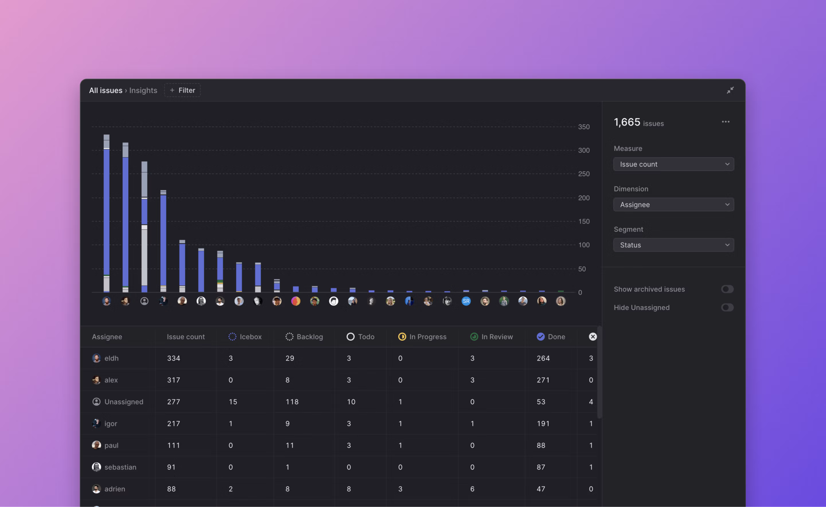
From the dropdown, choose the Measure and Slice for your Insight. This will generate a graph and table showing the data, with the Measure along the y-axis and Slice along the x-axis. Segments are optional and use color to slice the data further.
Values for Measure, Slice, and Segment vary depending on what issues are displayed in your view.
| Measure | What is it? | Type of graph | Automatic filters |
|---|---|---|---|
| Issue count | Total number of issues | Bar | None |
| Effort | Total estimate value | Bar | None |
| Cycle Time | Time from issue start to completion | Scatterplot | Only plots issues that spent time in progress before being completed |
| Lead Time | Time from issue creation to completion | Scatterplot | Only plots completed issues |
| Triage Time | Time issue spent in Triage status | Scatterplot | Only plots Triaged issues |
| Issue Age | Time since issue creation | Scatterplot | None |
Graph Interactions
Insight graphs are interactive, so that you can play with the dataset to learn more or focus on a specific type of issue.
Bar graph
- Hover over each bar to see data and percentile breakdowns.
- Select full bars or segments to temporarily filter your view to only those issues.
- Hovering or selecting bars or segments will highlight related data in the table below the graph.
Scatterplot
- Hover over the graph to see markers indicating that the data below the line represents 25%, 50%, 75%, and 95% of issues plotted.
- Select percentile markers to zoom in or out along the y-axis.
- Hover over points to see the issue details including the issue name, ID, and slice and segment values. This will also highlight related data in the table below the graph.
- Select points to go to open the related issue.
Burn-up charts
- Burn-up charts, or cumulative flow diagrams show how streams of work have changed over time. Unlike other insights, burn-up charts display your historical issue data so you can analyze and detect patterns across specific time windows.
- By default, burn-up charts show data in monthly increments. Adjust insights settings to plot the data week over week, or to include archived issues.
- When applicable, select Burn-up under the Slice menu to visualize your data in this style.
Table (below graph)
- Hover over row or specific cell to see corresponding data in graph
- Select row, column, or cell to temporarily filter issue view to only those issues
Select the three dot menu on the top right of the Insights panel to share your Insight.
- Copy a link, which can be viewed by anyone else in your workspace
- Export to CSV, to explore the data outside of Linear
Full Screen view
Insights can be opened in Full Screen view by selecting the expand button (just above the Segment dropdown). This gives you more room to explore the graph and table data.