Burn-up charts
Burn-up charts
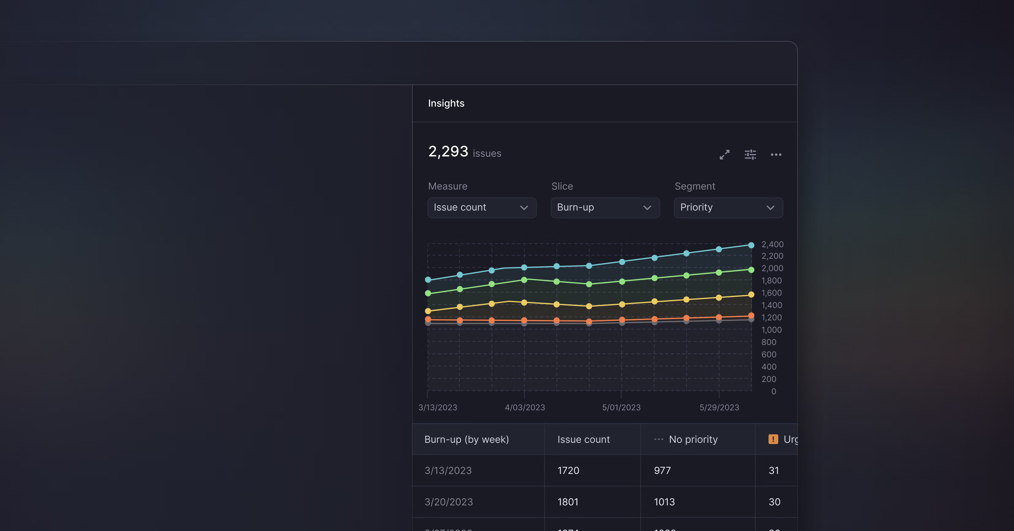
Linear Insights now includes burn-up charts, or cumulative flow diagrams, that show how streams of work have changed over time. Unlike other Insights, burn-up charts display your historical issue data so that you can analyze and detect patterns across specific time windows.
For example, you can create a burn-up chart to investigate how well you’ve been managing bugs over time.

In this snapshot, we are looking at issues with the label Bug across all engineering teams. You can see the overall bug growth by looking at the top level issue count. By segmenting by Status type, you can compare the ratio of closed to open bugs and see if you are fixing bugs faster than you are creating them. Look for spots where bugs get stuck in Triage or another workflow step.
Apply different segments to your burn-up chart to explore:
- How effort has been allocated across teams
- Changes in the type of work your team has focused on
- If your backlog is under control
- How scope has increased in a specific project
By default, burn-up charts show data in monthly increments. Adjust Insights settings to plot the data week over week, include archived issues, or to expand the view to fullscreen. Burn-up charts based on large data sets can take a bit longer to generate. We are working on performance improvements to get them to the same speed that you are used to from other Linear features.
Insights is now out of beta and available to all Plus plan customers. Learn more about the feature and sign up to a free 30-day trial to try Insights and see if it is right for your team.
- [API] Fixed an issue where progress would be reported as 0 for archived projects
- We will now properly convert regular emojis from :emoji-name: format to emoji when they come from Slack or over the API
- Fixed a problem with the inability to post a comment reply when editing a parent comment
- Improved logic for pre-filling project/project milestone/cycle data when creating issues from Inbox or Triage views
- Fixed the icon size in board cards
- Fixed an issue that would cause uploading images to disappear when the editor lost focus
- Fixed a small layout overlap in threaded comments on mobile devices
- Fixed authentication with Figma in the desktop app
- Fixed a problem with sub-issue drafts not being cleared properly
- Project popovers now includes project state
- Fixed a problem where Cmd Tab away and back made the app unable to change issue property
- You can now preview and open issue links from list and board views using interactive popovers
- Fixed a bug where not all projects would be selectable when picking specific projects for project views
- Fixed a problem with assignee and project controls were unresponsive in the fast modal creation
- Fixed milestone button animation when you unselect the last issue in a project
- Clarified issue workflow wording when both the GitHub pull request and commit integrations are enabled
- We now add a reference to the Linear user who authored the Slack message in the issue description when creating an issue from a Slack message
- Fixed a bug causing date matching for inputs such as “in twelve hours” to be incorrect
- Fixed an issue that prevented comments from appearing in search results
- Fixed an issue that could result in the list of archived issues rendering twice