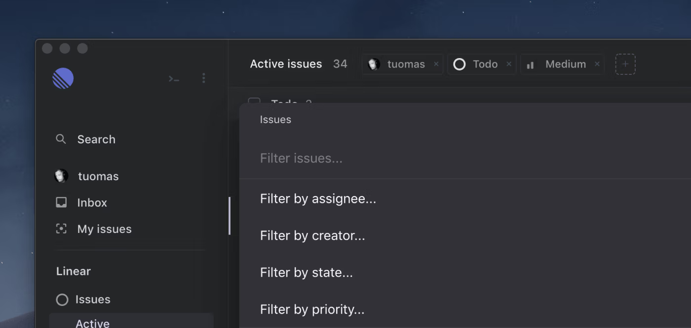
Filters
Filters

Once your team’s issue count starts growing, filtering becomes necessary to narrow down the scope of issues that you want to look at or manage. We gained valuable experience from our initial filter design, and wanted to improve the design in two ways:
- The filter UI should scale with more options and filter types
- You should be able to use filters 100% via the keyboard
This week we fully redesigned and reimplemented how filters work. In any view that lists issues - including the board - you can access filter via the f shortcut. Once a filter has been applied it can be removed with the Shiftf shortcut.
Filters are now view based, so you can, for example, apply different filters to “My Issues” and “Active Issues” and jump between these views without losing each filter.
Other improvements and fixes
- Project status can now be changed via actions and the s shortcut
- Projects are sorted according to their status
- Labels can now be modified from the team settings
- Fixed navigation issues, the back-button will now yield more expected results
- Cycle burn-up graphs have less crowded x-axis labels for long cycles
- @Mentioning users now work better if you have a substantial amount of team members
- Peek now deactivates if you hide the client by Option-clicking your desktop on a Mac.
- Fixed issues with project target date entry on Safari
- Keyboard help has been updated
- Issues are now longer selected when typing x with the command menu open
- Modal states are now visually more distinguishable