Styling Linear for the future with StyleX

It took much longer than anticipated, and at times it was a struggle to keep the momentum going, but more than a 1,000 PRs later, we migrated Linear’s React applications from styled-components to StyleX.
styled-components served Linear surprisingly well for a long time. Its API was very flexible, styles stayed colocated with components, and you could reach for regular CSS whenever you needed something more custom. That suited us because our team is unusually sensitive to little things, like the occasional pesky border radius.
Eventually though, the endless configurability became a liability.
CSS already makes it too easy to style things at a distance, and patterns like styled(Button) made it normal to reopen a component from the outside rather than make its styling contract explicit. We felt the pain of this sharply after Linear’s redesign a few months ago, which has left us chasing a long tail of UI regressions.
As our team grows, we wanted to create a stronger foundation for how UI is composed. Defining these boundaries is becoming especially important as agents contribute more and more to our codebase.
Another more practical reason to migrate was performance. We care about keeping Linear fast and CSS-in-JS adds work during rendering to generate styles and inject CSS rules. The final straw was the performance regression we saw after upgrading to React 18 that introduced concurrent rendering, while styled-components entered maintenance mode.
The question, then, was how to migrate a large, active codebase without grinding product work to a halt. Migrations seem like a natural fit for coding agents because much of the work is repetitive, but this one had too many edge cases to hand over wholesale.
As the migration stretched on, however, model capabilities shifted. Fable and Sol launched midway through the project, making agents capable of doing better work. What follows is everything we learned during a migration that combined deterministic tooling, agents, and human judgment, with each taking on more or less of the load as the project ran its course.
The case for StyleX
In our search for alternatives, we ended up with a set of non-negotiables for our next library. Whatever we chose had to do the bulk of style generation at build time instead of while the app renders. It had to make styling at a distance deliberately difficult, not just discouraged by convention, while also giving components ways to expose clear styling contracts. Style merging had to be predictable across files without specificity games. And the library had to work well with React, be actively maintained and feel like a safe long-term bet.
Developer ergonomics mattered too, and increasingly, so did agent ergonomics. Common cases should stay simple, styles should live close to components, and there should be pragmatic escape hatches when you need them.
We looked at most of the major styling options available for React. The closest alternative was vanilla-extract, which gave us static extraction and strong type safety. But its API felt more fragmented, and the separation between component and style files did not fit how we like to work.
StyleX by Meta gave us a better balance. Styles stay colocated with components, the API is small, and style resolution is deterministic. It also gives us type-safe styling contracts and makes it deliberately harder to reach into a component and restyle it from the outside.
Those constraints come with tradeoffs. Migrating from the full flexibility of CSS template literals to a constrained atomic system makes some patterns harder, including parent-dependent selectors, global selectors, and component restyling through wrappers. However, somewhat ironically, that’s also the point. Many of the patterns that are hardest to migrate are the ones that made the old system difficult to reason about at scale.
How we made a huge migration tractable
If we were starting this migration today, we would lean on Fable and Sol a lot more to carry it out directly. When we began, however, styled-components made this a particularly difficult migration to automate because it gives you a Turing-complete language, the full power of CSS, and a completely open API. There are countless ways to express the same intent, and at the time, it was uncomfortably easy for agents to output something that looked correct but wasn’t.
Linear not having a formal design system made this harder. We have shared components, but many of them evolved with broad APIs rather than clear styling contracts.
Given these constraints, I started with a deterministic codemod. styled-components-to-stylex-codemod began as a large test suite and a fairly deliberate architecture, which agents then helped build out. It includes an online playground, cross-file selector handling, and regression coverage for most of the edge cases we have encountered.
Reducing risk during the migration
styled-components and StyleX would have to coexist for a while because we didn’t want to freeze product development. We derisked that interim period in a few ways:
- Define the styling foundation first. Before the codemod could do useful work, we had to define the StyleX variables, constants, and shared primitives that migrated components should use.
- Spawn agents with clear scopes. Agents work better when they have a narrow scope, a codemod runner, examples, validation scripts, and a clear checklist. We used agents to inspect the rendered UI and compare the generated CSS with the original but found that they often got stuck trying to validate visual differences like complex hover states, theming branches, or small layout differences. This required a lot of manual testing until Fable and Sol were released.
- Start with leaf nodes. We first migrated components that didn’t wrap or restyle other styled-components. That kept diffs smaller, reduced interactions with the cascade, and let us learn in lower-risk parts of the component tree before touching shared primitives.
Encouraging adoption across the team
Beyond the technical details of the migration, we also needed to nudge people away from styled-components. We wanted to make progress visible and build momentum around getting the rest of the codebase onto StyleX.
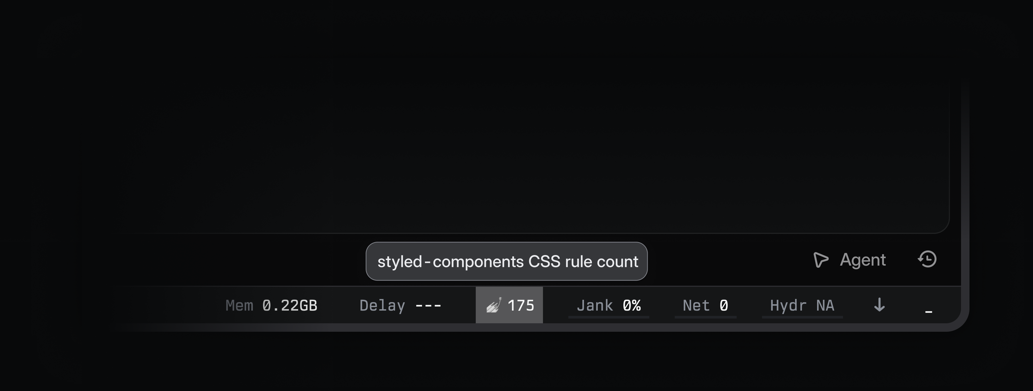
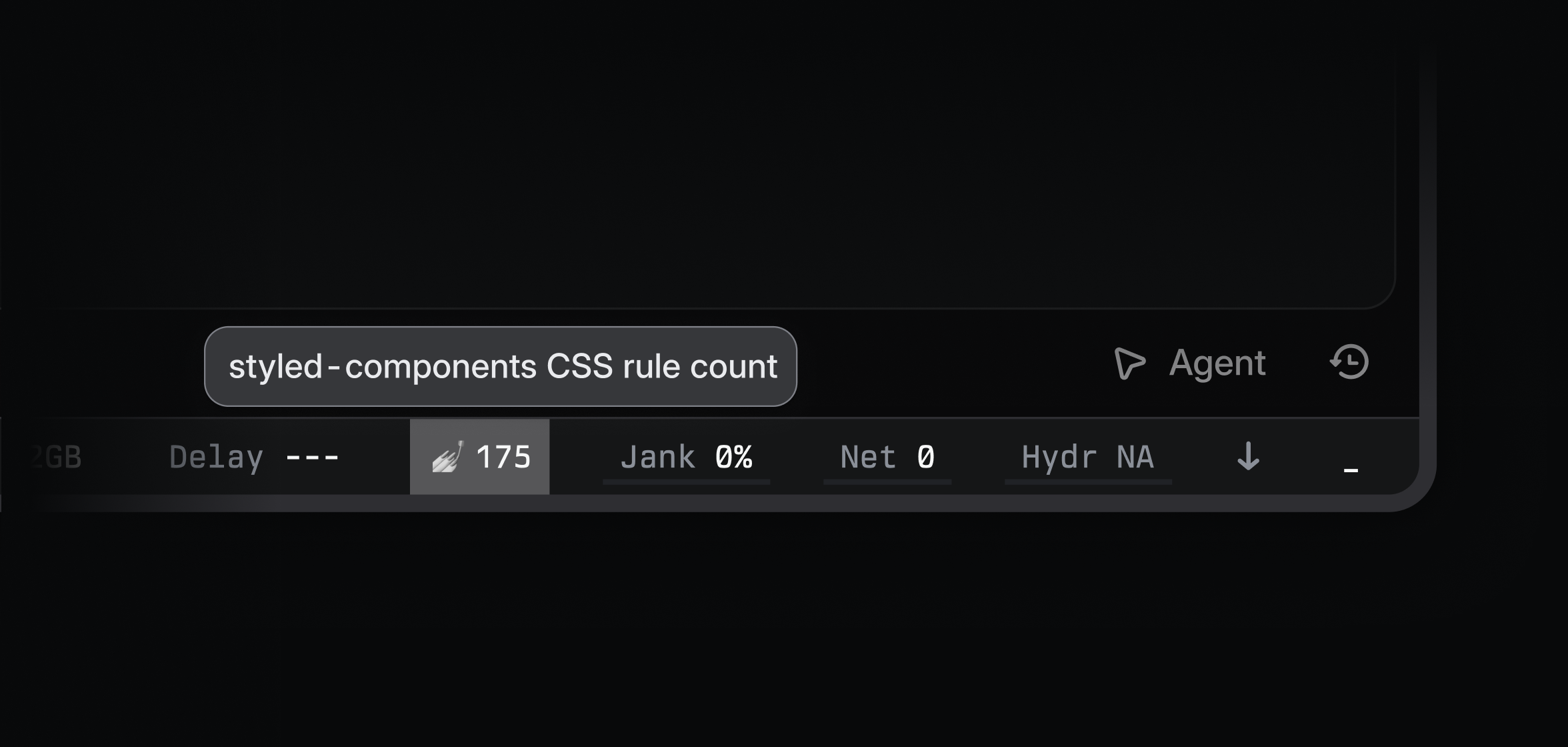
We added a counter to our dev tool bar to track the number of styled-components still on the page, so the number would tick up or down as you navigated through Linear.
We also built a tool that highlighted which components were using styled-components versus StyleX, which made it easy for us to see whether a particular part of the codebase had been migrated, but perhaps more importantly, served as inspiration for people to migrate off styled-components.
We generated a graph continuously to track migration progress across the codebase and estimate when we would finally be able to say goodbye to styled-components (yes, we celebrated over drinks on Zoom).
StyleX adoption per week
| Week of | Styled-components files | StyleX-only files |
|---|---|---|
| Mar 8, 2026 | 100% | 0% |
| Mar 15, 2026 | 96% | 4% |
| Mar 22, 2026 | 96% | 4% |
| Mar 29, 2026 | 93% | 7% |
| Apr 5, 2026 | 93% | 7% |
| Apr 12, 2026 | 92% | 8% |
| Apr 19, 2026 | 90% | 10% |
| Apr 26, 2026 | 90% | 10% |
| May 3, 2026 | 87% | 13% |
| May 10, 2026 | 80% | 21% |
| May 17, 2026 | 74% | 26% |
| May 24, 2026 | 69% | 31% |
| May 31, 2026 | 56% | 44% |
| Jun 7, 2026 | 49% | 51% |
| Jun 14, 2026 | 46% | 54% |
| Jun 21, 2026 | 44% | 56% |
| Jun 28, 2026 | 40% | 61% |
| Jul 5, 2026 | 27% | 73% |
| Jul 12, 2026 | 22% | 79% |
| Jul 19, 2026 | 13% | 87% |
| Jul 26, 2026 | 8% | 92% |
| Aug 2, 2026 | 3% | 97% |
| Aug 6, 2026 | 0% | 100% |
Styled-components files added per week
| Week of | Styled-components files added |
|---|---|
| Mar 8, 2026 | 12 |
| Mar 15, 2026 | 20 |
| Mar 22, 2026 | 20 |
| Mar 29, 2026 | 10 |
| Apr 5, 2026 | 10 |
| Apr 12, 2026 | 11 |
| Apr 19, 2026 | 22 |
| Apr 26, 2026 | 3 |
| May 3, 2026 | 10 |
| May 10, 2026 | 9 |
| May 17, 2026 | 3 |
| May 24, 2026 | 4 |
| May 31, 2026 | 0 |
| Jun 7, 2026 | 1 |
| Jun 14, 2026 | 1 |
| Jun 21, 2026 | 0 |
| Jun 28, 2026 | 0 |
| Jul 5, 2026 | 0 |
| Jul 12, 2026 | 1 |
| Jul 19, 2026 | 0 |
| Jul 26, 2026 | 0 |
| Aug 2, 2026 | 0 |
| Aug 6, 2026 | 0 |
Finally, a bot called out new styled-components in PRs, keeping us accountable and making it harder for regressions to slip through.
Enforcing StyleX at scale
We also built tooling to enforce the conventions we wanted the codebase to have after the migration.
Custom lint rules make the intended path obvious and stop old patterns from creeping back in. Oxlint handles the fast, local checks, including common authoring mistakes, design-token usage, and cases where React props can overwrite generated StyleX output.
Some rules need more context than a per-file linter has, so we also built a custom type-aware repository checker. It follows components, imports, and styles across files to verify styling APIs and detect cases where StyleX’s property-level merge behavior can silently remove base or conditional styles.
These rules fall into a few broad groups:
- Migration and legacy cleanup. These keep the old styling system from returning and help remove migration leftovers. Examples include banning
styled-componentsimports, finding components that still expose unusedclassNameorstyleprops. - Component styling APIs and cross-file propagation. These make the
sxprop the standard styling interface between components and ensure that styling support survives component boundaries. They check that StyleX-backed components exposesx, merge it after their local styles, do not silently drop it, and do not advertise styling props they never apply. Our repository checker also traces StyleX support through wrappers and polymorphic components, verifies thatsxis materialized correctly, and detects conditional styles that disappear across component boundaries. - Style composition and precedence. These catch cases where
className,style, JSX spreads,sx,stylex.props(), ormergedSx()overwrite one another. They also detect StyleX-specific merge problems, such as a flat caller override replacing all of a component’s conditional states. Shorthand rules are part of the same concern, rejecting multi-value margin and padding shorthands and conditional shorthand/longhand combinations where StyleX’s property priority would silently change the result. - Design and interaction consistency. These replace hardcoded visual values with shared variables for colors, typography, shadows, animation, cursors, and thin borders. They also standardize hover, press, and link behavior. For example, our
highlightMixinmaps to:hoveron pointer devices and:activeon touch devices, while external-link underlines use one shared mixin so they remain compatible with the user’s link-underline preference. Suppressions are allowed, but they have to be narrow and justified. - Compiler, runtime, and theme safety. These cover less obvious StyleX details, such as rejecting arithmetic on
defineConstsvalues, guarding undefined dynamic style values, and replacing raw CSS variables with typeddefineVars()references. They also prevent themed tokens from being used as root-leveldefineVars()defaults and require a themed portal component when rendering outside the current DOM subtree.
Finally, we added a few build-time extensions for Vite for behavior that StyleX doesn’t support directly such as consistent hover and press feedback across pointer and touch devices.
StyleX is not a closed system
We did not try to eliminate escape hatches entirely. For problems that are still fundamentally CSS-shaped, such as global selectors or restyling third-party DOM, we use CSS Modules as a scoped and explicit fallback.
In other places, we extended StyleX instead, most notably, theming. Linear themes are generated rather than hand-authored. A custom theme starts with a few inputs, like base color, accent color, and contrast, from which we derive more than a hundred color variables in LCH space. And it goes further than most people expect, rather than being a background swap, when a row is selected, we regenerate the entire theme with the selected background as the new base, so labels, borders, and controls all re-derive against it. We do the same for focus, menus, and elevated surfaces, each scoped to its subtree through a nested ThemeProvider.
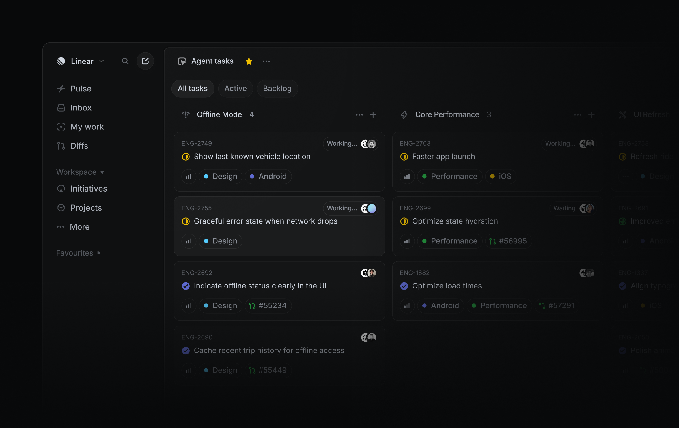
That model doesn’t map particularly well to StyleX’s built-in theming. Components still author styles against ordinary stylex.defineVars() tokens, but we treat those tokens as placeholders. Our ThemeProvider extracts the hashed custom-property names generated by StyleX and injects one CSS rule for each generated theme at runtime, scoped to the provider boundary. We essentially have the same theming model, but with the rest of the styling system moved out of the render path.
The payoff
While the migration has made Linear more performant, the exact end-to-end impact is hard to attribute because it’s interleaved with our endless effort to optimize performance.
To try and isolate the styling cost, we used Fable to compare profiles from March with the client today and looked specifically at work related to generating and injecting styles. On view-heavy pages, removing runtime style injection reduced main-thread CPU work by roughly 20-to-35%. In our tests, that translated to around 30% faster on a mid-tier machine. The client went from injecting hundreds of CSS rules during a navigation to zero.
Arguably the more valuable change, though, is that styling now has much clearer boundaries at Linear. Components have explicit styling contracts, precedence is deterministic, and many patterns that used to depend on convention or the cascade are now enforced by tooling. More than 1,000 PRs later, we ended up with a styling system that is faster at runtime, harder to misuse, and better suited to a codebase increasingly written by agents.