A Linear spin on Liquid Glass

Earlier this year, we were ready to redesign our mobile app. The original version had served us well, but it was built with a narrow use case foremost in mind: individual contributors engaging with issues.
A year later, Linear is the product development platform of choice for larger, more complex organizations, and the app wasn’t serving everyone equally well. In particular, executives and managers want an overview of what’s happening across their teams and the existing structure, optimized for a single workflow, couldn’t easily support that.
We knew we needed a more customizable foundation that would allow us to make the navigation more flexible, adaptable, and expandable depending on a user’s role.
Then in June, something fortuitous happened: Apple announced Liquid Glass at WWDC. We watched the keynote and right away it was clear Apple had landed on a design language that felt modern and expressive. It also matched the aesthetic shift we were already imagining.
But as we explored it more closely, we realized adopting Apple’s new APIs wouldn’t give us the control we needed to build the customizable navigation that was the real purpose for our redesign. Instead, we decided to recreate our own version of Liquid Glass. We wanted to capture what we loved about it while retaining the flexibility to design a navigation experience that fits the way people use Linear.

It was without question the harder path.
We have a small iOS team—just two engineers—and fully adopting Apple’s APIs would have been much simpler. But rebuilding it ourselves would allow us to bring our new navigation to all of our users, including those on iOS 18, while freeing us from the compromises and uncertainty that come with depending on someone else’s design system. We knew that Liquid Glass had remained a moving target throughout the beta period of iOS 26, and Apple is still making changes to it today (like the recently introduced Tinted Glass option).
It was a go-big-or-go-home moment, which made the choice easy. We weren’t deciding against Liquid Glass, and our goal wasn’t simply to rebuild it as it was. We wanted to push the design to a new level that felt true to the Linear brand and better suited the way our users work.
Aqua versus ProKit
We knew that building our own design system might seem like an unusual choice. But it also followed a tradition that runs through Apple’s own design history.
Nearly two decades ago, the company drew a similar line between consumer and professional software, with Aqua on one side and ProKit on the other.
Aqua defined the look of consumer Mac software for nearly a decade. Similar to Liquid Glass, it was exuberant, with pinstripes, bright highlights, glassy buttons, and drop shadows everywhere. The goal was to make the interface feel tactile and approachable.
What fewer people remember is that during that time Apple also used another design language called ProKit. It traded away Aqua’s reflections and translucency for flatter gradients and sharper edges. ProKit was built for professional tools like Final Cut or Logic with complex, information-dense workflows where clarity and control are more important than visual flourish.

Liquid Glass is a beautiful successor to Aqua. Its primary purpose is to feel fluid and friendly for a broad consumer audience. Apple has to design for every kind of app—education, entertainment, banking, fitness—and build systems that adapt to all of them.
We have a different set of constraints. Our users come to Linear to do a specific kind of work in a focused environment. That gives us freedom to push the design in specific ways Apple can’t.
In that sense, we saw an opportunity to take Liquid Glass’s aesthetic qualities—its translucency, depth, and physicality—and apply them with a ProKit philosophy: purpose-built, disciplined, and designed for sustained focus.
Owning our materials
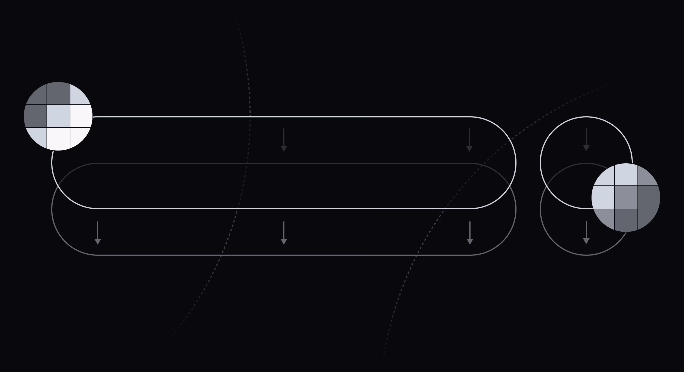
To rebuild the glass effect from first principles, we started with a single SwiftUI view modifier that applies multiple effects at once. Behind the content, a Gaussian blur sets the base layer using a UIVisualEffectView. Above it, we layer a subtle gradient for structure, then a specular highlight calculated in a SwiftUI shader.
Making the highlight behave convincingly required describing the shape mathematically. We generate a signed distance field (SDF)—a way of representing a shape mathematically—for the continuous rounded rectangle surrounding the content. Then we use its gradient to build a normal map, and from that determine how much light each point catches.
Because we can’t apply the shader directly to the UIVisualEffectView, we layer it on top using a Plus Lighter blend mode. Finally, we mask the whole thing with the same SDF and add a subtle shadow for added contrast.
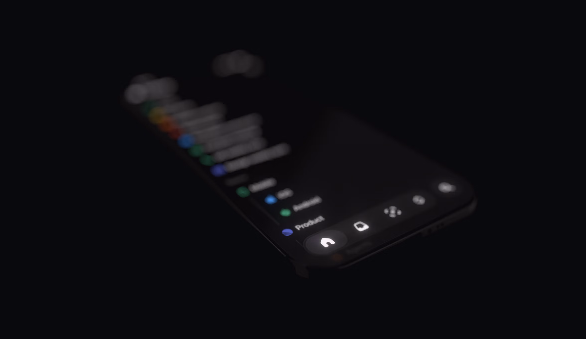
After we’d defined the surface, we focused on how the light itself should behave. Instead of faking highlights with static gradients, we modeled a physical light source that moves through space as you interact with the app. Because the lighting is calculated in real time on the GPU, the surfaces respond naturally to movement—soft highlights shift as you scroll, tap, or move through the app.
Implementing a customizable tab bar
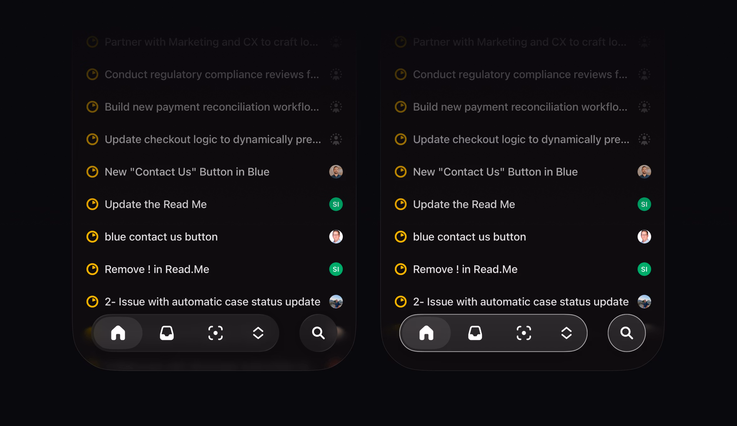
Once we had control over the material, we could extend it to the part of the interface that mattered most for this redesign: the tab bar. Apple’s stock tab bar in iOS 26 looks similar on the surface to the one we ended up with, but you can’t meaningfully change its shape or behavior. We wanted a bar that could expand to fit different navigation patterns, so we built it ourselves. Owning the material made that possible.
This also gives us the flexibility to customize the bar in the future. Five items is a sensible limit for apps for a general audience, but Linear users often need more. Our tab bar can expand to accommodate additional entries, similar to how the tab bar can turn into a sidebar on iPad.
Sweating the details
Once the core system was in place, we focused on the tactile and visual details that make the interface modern.
When you touch an element, it lifts up slightly, providing a quick pulse of feedback. Dragging beyond the edge of the view distorts it slightly, resolving the physical tension and making the UI feel responsive.
We also replicated some of the smaller effects Liquid Glass uses, to make our custom material feel at home on iOS. At the top and bottom edges of scroll views, we apply a variable blur that intensifies as content approaches the edge of the screen. This is a detail Apple relies on internally but doesn’t expose through public APIs, so we had to get creative. We layered a subtle color mask over it to match the soft edge Apple uses systemwide.
We spent a lot of time on accessibility details. Apple’s system glass automatically adapts to settings like Increase Contrast mode. When a user enables that setting, iOS draws solid outlines around glass elements. Our material now mirrors that behavior exactly, preserving legibility for users with accessibility settings turned on.

The one effect we chose not to reproduce was Liquid Glass’s refraction. Technically, it requires access to pixel-level data that isn’t available to third-party developers. Aesthetically, it also wasn’t the right choice because refraction can make dense professional interfaces harder to read. By relying on precise blurs, masking, and lighting, we maintained a sense of depth without losing clarity.
None of these details were individually complex to implement. But like so much of what we do when building Linear, it’s the sum total that creates an enjoyable and productive user experience.
Customization for a growing user base
This new visual language is just the start of a broader architectural redesign of our mobile app. As Linear’s user base grows, people in different roles are using the app in more varied ways. This new foundation, which we built and own ourselves, lays the groundwork for more adaptable navigation and customizable toolbars in the future.
We’ll have more to share about that soon. In the meantime, read more about the redesign in our changelog or download the update in the App Store and Play Store.