Welcome to the new Linear
Welcome to the new Linear
Today, we are revealing the result of many weeks of work redesigning Linear’s interface. You can read about the changes we made and the design process in-depth in our two-part series:
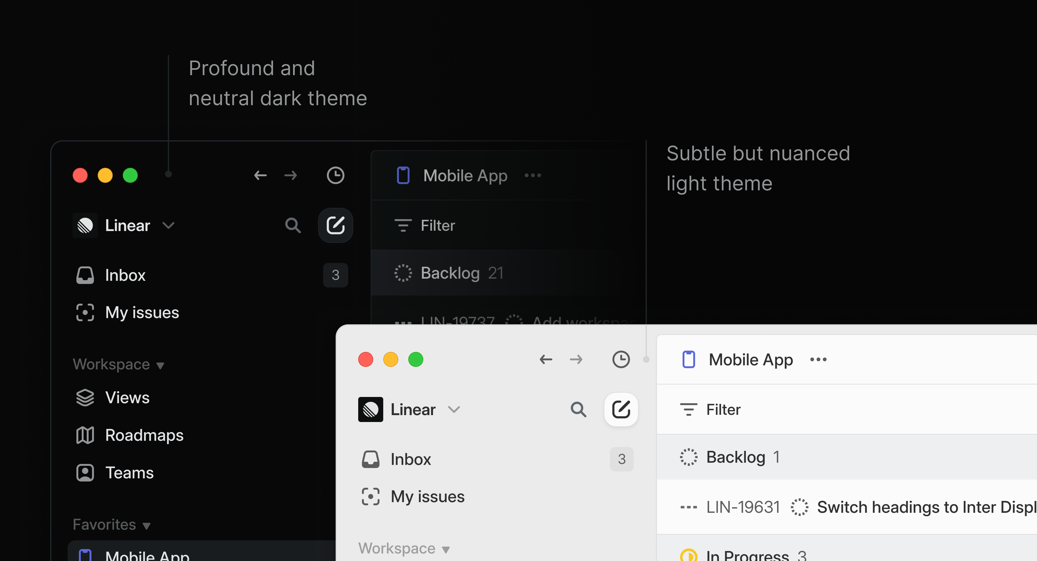
We have redefined the foundational layers of Linear's design to improve the hierarchy, balance, and density of all interface elements. As you use the application, you will see improvements across every view.
Whether you heavily rely on favorites and folders or prefer a minimalist approach, your sidebar should feel better and less cluttered now.
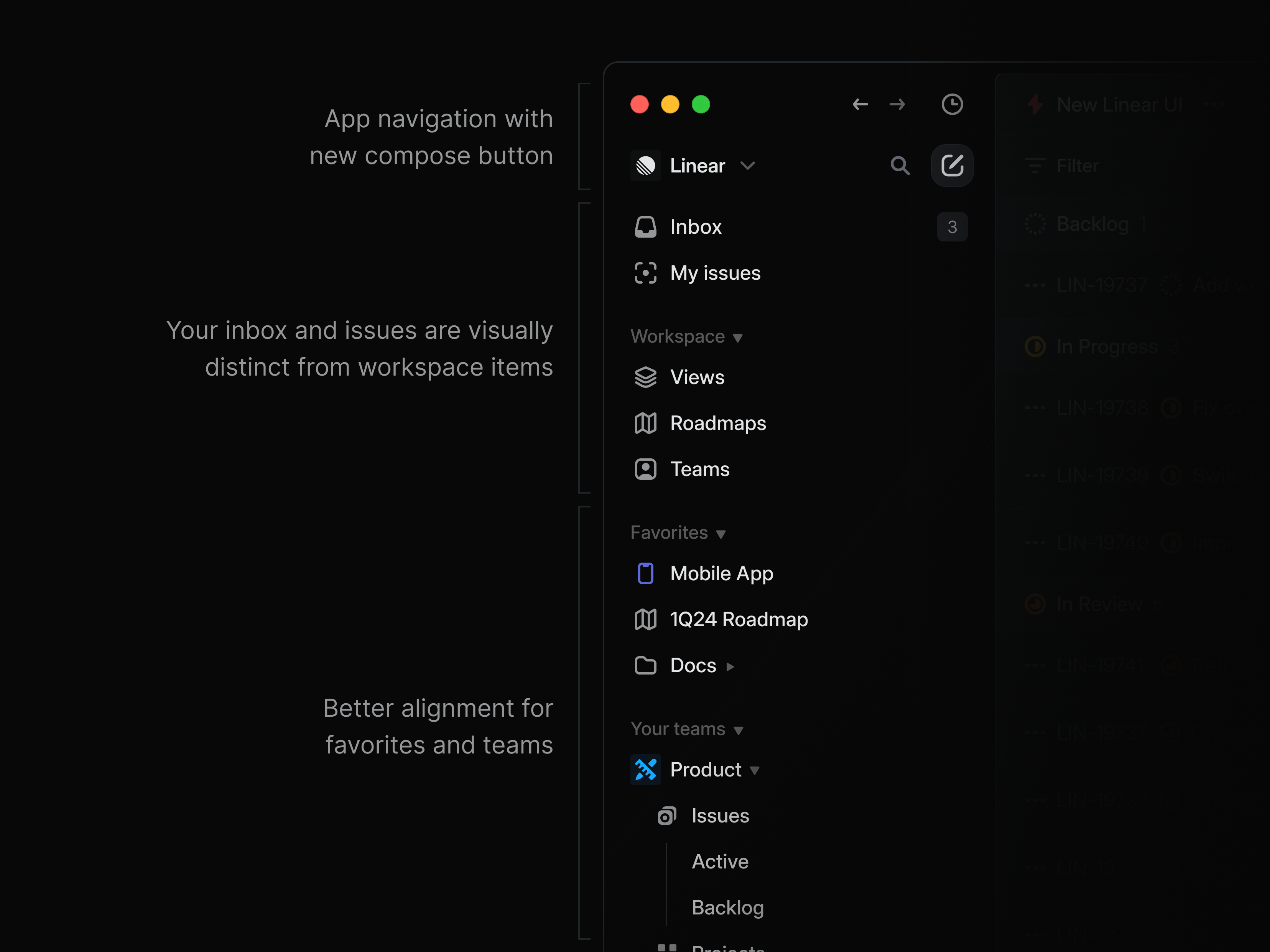
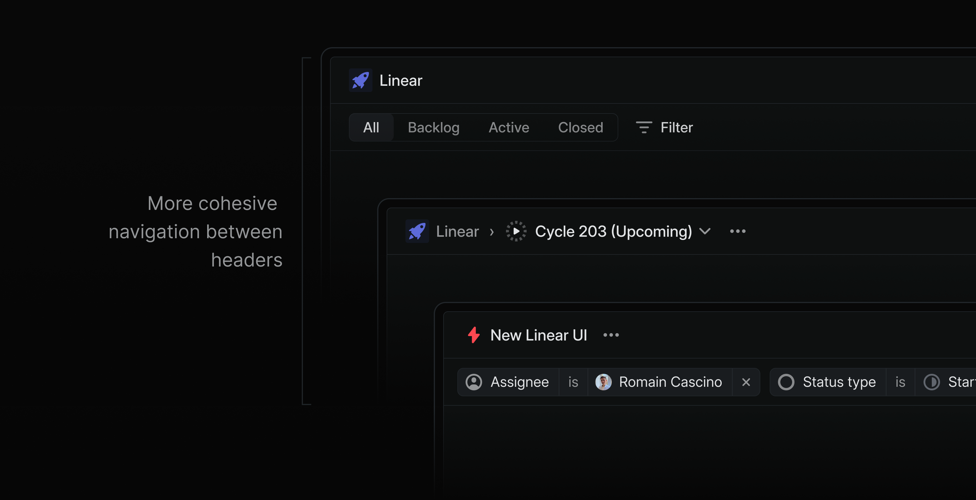
Tabs, headers, filters, and panels are adjusted to reduce the visual noise and clutter. The current view, available actions, and meta properties are now presented more clearly.
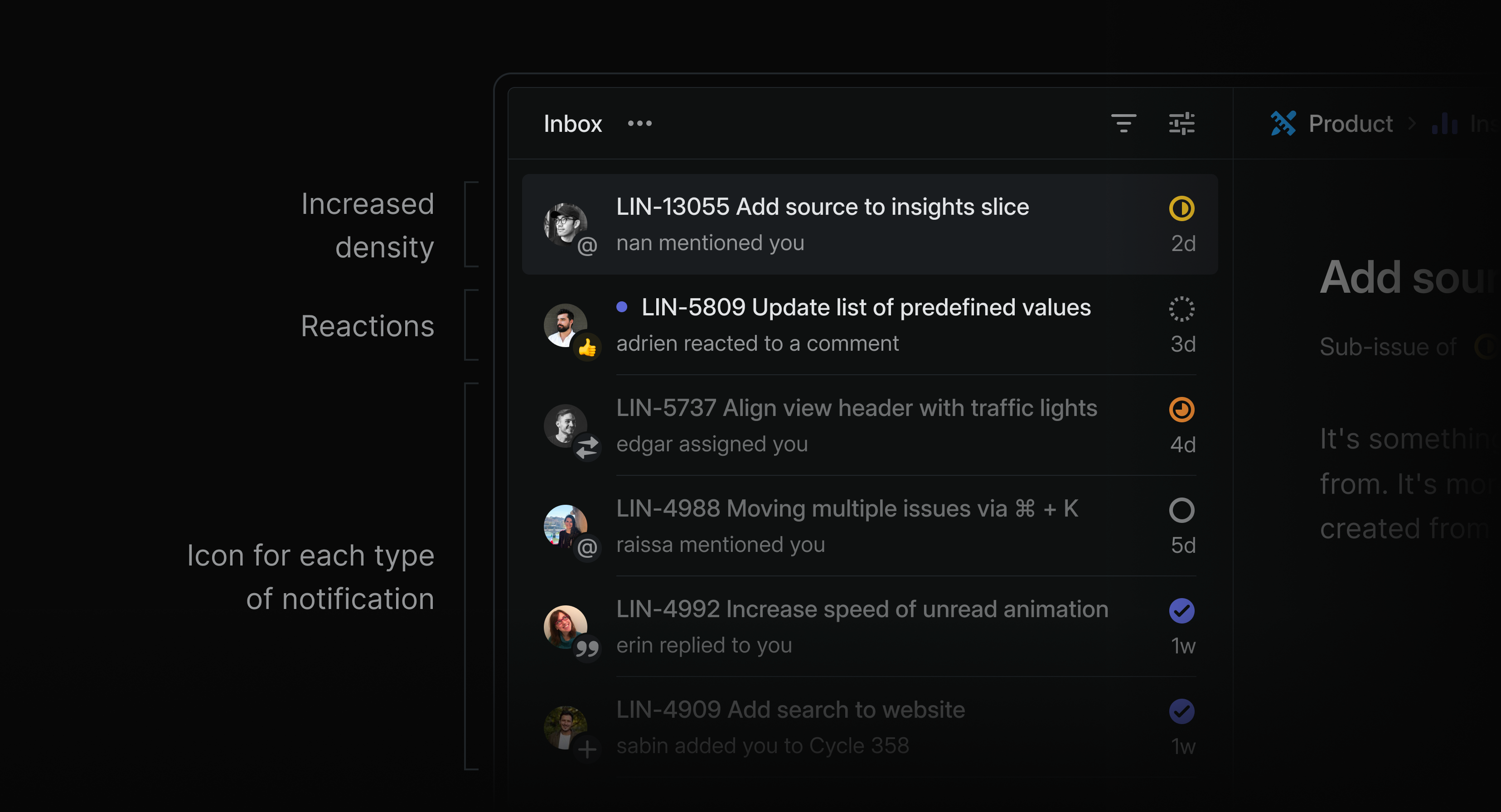
The Inbox has a new look with increased density and better contrast.
The default dark and light themes have increased contrast. If you are feeling nostalgic, you can still apply the Magic Blue theme to the improved UI from the command menu or settings. We have also built a new theme generator that lets you easily adjust the themes.